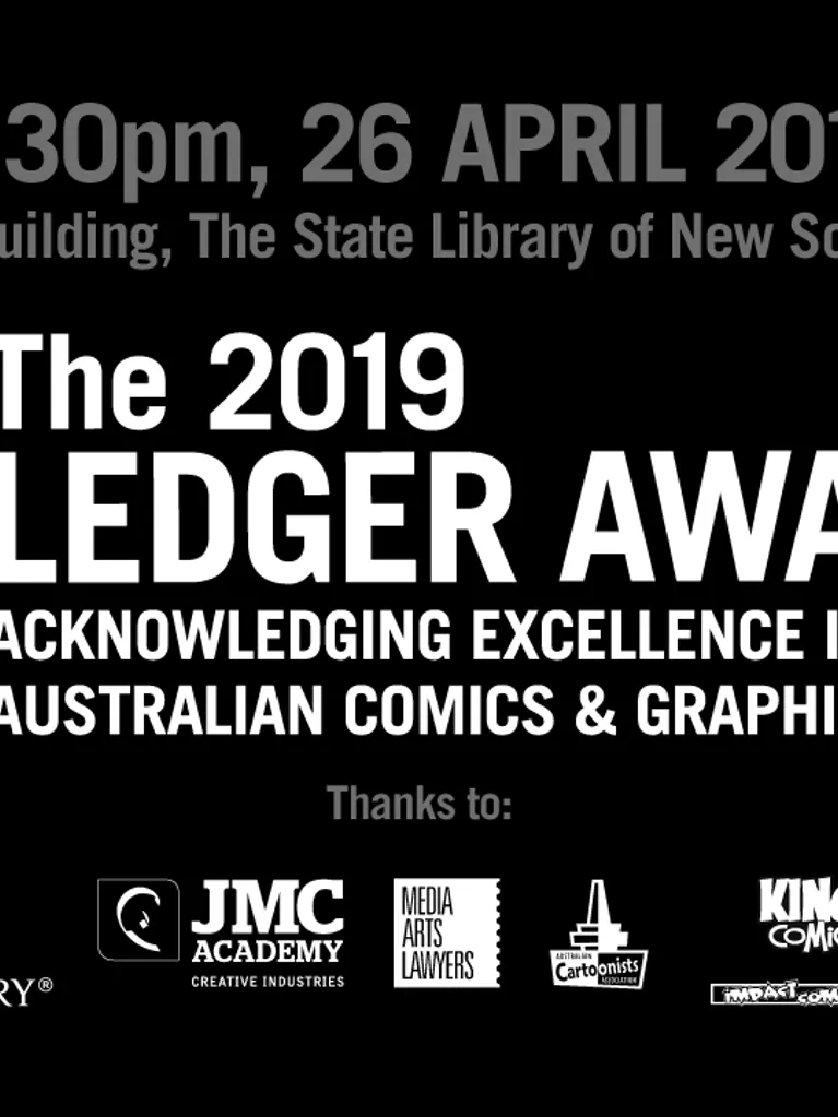
Design (Visual Communication) Student, Serena, recently put her hand up for the role of Head of Visual Design during the 2019 Ledger Awards for her TRI 6 Industry Project unit.
For my Industry Project unit, I was the Head of Visual Design for The 2019 Ledger Awards. Initially, we had a team of four and I was the team leader. During the first few months, I managed the tasks and workflow for my team, along with organising the client pitches. My role also included managing files and assets, along with communication between us and our lecturer, Tim.
This year, my classmate Chandra and I were responsible for creating The Ledger Awards style guide, social media graphics and banners. It was my responsibility to layout the information, images and logos for the different kinds of graphics. I worked closely with Tim to produce Facebook and Twitter graphics, website banners, Instagram graphics, and create eight pull up banners and ceremony slides for the big night.
There are four things I learned from my experience...
1. Have more than one set of eyes look over your work
It’s very important to double-check your final outputs for any errors in the type, image size, or layout. Having an editor can help pick up mistakes you might glaze over when looking at the same piece of work for hours. When in doubt, step back and look at your design to see if everything is spaced nicely.
For the past couple of months, the social media graphics I created have been posted online. However, it was really exciting to see the pull-up banners and ceremony slides I designed being used in person.
2. Don’t present a client with too many options
Two of my lecturers at JMC gave me tips on presenting works to clients and I’ve combined them. Don’t present a client with too many options, especially if you don’t like one because they will pick that one. You should have confidence in your choices when you anticipate the best solution. If it’s not quite right then that’s what feedback is for!
Want to study Design (Visual Communication) at JMC?
3. Stay on top of your Organisation
Thirdly, I always have to remind myself to stay on top of my organisation. By the Ledger Awards night, I had over 500 files on my computer for the project. From the start, ensure that everything you’re working with including logo files, graphics, images and text are all named appropriately and sorted into folders to make locating them easy. It’s tempting to name something test_01 or aaaa.jpg but you’ll struggle to find it again in a month! I learned that it’s important to organise within the files too, especially when producing a batch of graphics.
For example; the Short Listed Projects graphics were composed of the Ledger Awards logo, dividing line, heading, and cover image of the comic. All these elements had to be identical except for the different images. I used rulers and guides to create consistency across the posts, and it also helps to have artboards and layers named accordingly.
4. Working for someone else is a great working experience
A lot of my past assessments in the design course involved making designs for myself. What I liked about taking on this project was working for someone else. It was challenging to balance simplicity and excellence or boldness and elegance when bringing Tim’s vision for the Ledger Awards into the design.
From the production meetings to attending the ceremony, being a part of this event was a very rewarding experience. One of my favourite parts, of course, is seeing my work being used in the digital space and real world. I appreciate the opportunity I’ve had to do this work, and I’m glad I’ve been exposed to a lot of Australian comics because I intend to read a bunch of them!


